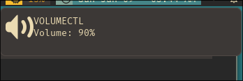
I always use all:unset in my css files and I did the same when configuring the swaync notification but somehow when using it inside global selector *{} it doesn't show the volumeslider which is shows in a notification, related pictures will be attached. I wanna use all:unset and so I want to know how to re-enable volumeslider without removing all:unset. I've found this config to also use it but its in scss so I didn't test it.
with all:unset
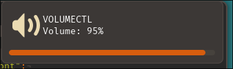
without all:unset
Full style.css ->
* {
  all: unset;
  font-family: "FiraMono Nerd Font";
  font-size: 10pt;
  font-weight: normal;
}

.notification {
  background: #3c3836;
  border: 1px solid #504945;
  border-radius: 8px;
  padding: 7px;
}

.notification-content {
  background: #3c3836;
  color: #ebdbb2;
}

.notification-row {
  margin: 2px;
}

.close-button {
  background: #cc241d;
  border-radius: 50%;
  color: #282828;
}

.close-button:hover {
  background: #fb4934;
  transition: all 0.15s ease-in-out;
}

.time {
  color: #98971a;
  font-size: 9pt;
  margin-right: 24px;
}

.control-center {
  background: #3c3836;
  border: 1px solid #504945;
  border-radius: 8px;
  padding: 8px;
}

.control-center-list-placeholder {
  background: #3c3836;
  color: #7c6f64;
}

.widget-title {
  background: #3c3836;
  color: #ebdbb2;
}

.widget-title > button {
  background: #98971a;
  color: #282828;
  border-radius: 4px;
  padding: 2px;
}

.widget-title > button:hover {
  background: #b8bb26;
  color: #282828;
  transition: all 0.15s ease-in-out;
}

.widget-dnd {
  background: #3c3836;
  color: #ebdbb2;
}

.widget-dnd > switch {
  background: #665c54;
  border-radius: 4px;
}

.widget-dnd > switch:checked {
  background: #d65d0e;
}

.widget-dnd > switch slider {
  background: #282828;
  border-radius: 4px;
}

Solved it. Just needed to use progressbar and progress classes in style.css. Adding background color did the job.