this post was submitted on 26 Aug 2023
364 points (97.4% liked)

Voyager

5365 readers
29 users here now

The official lemmy community for Voyager, an open source, mobile-first client for lemmy.

Download on App Store

Download on Play Store

Use as a Web App

Download on F-Droid

Rules

  1. Be nice.
  2. lemmy.world instance policy

Sponsor development! 👇

Number of sponsors badge

💙

founded 1 year ago
MODERATORS
364
submitted 1 year ago* (last edited 1 year ago) by [email protected] to c/[email protected]
 

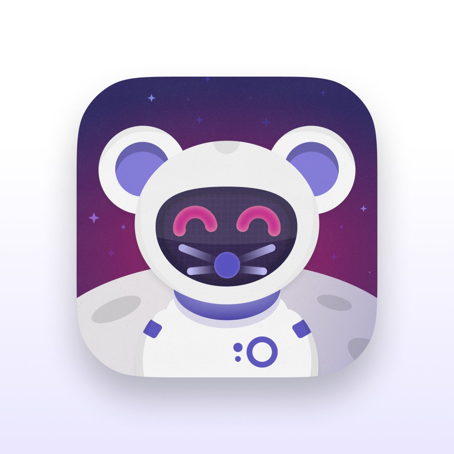
I recently shared some Apollo tribute icons that I made. As you all rightfully said, an antenna on a Lemmy app doesn't make much sense! I had another stab, but this time tried some slightly more original ideas, and made something that I feel captures "Voyager". Let me know what you think.

Happy to provide another free download link for this one if there's demand. Also, if you want any tweaks or have any other ideas, please let me know. I could make these all day!

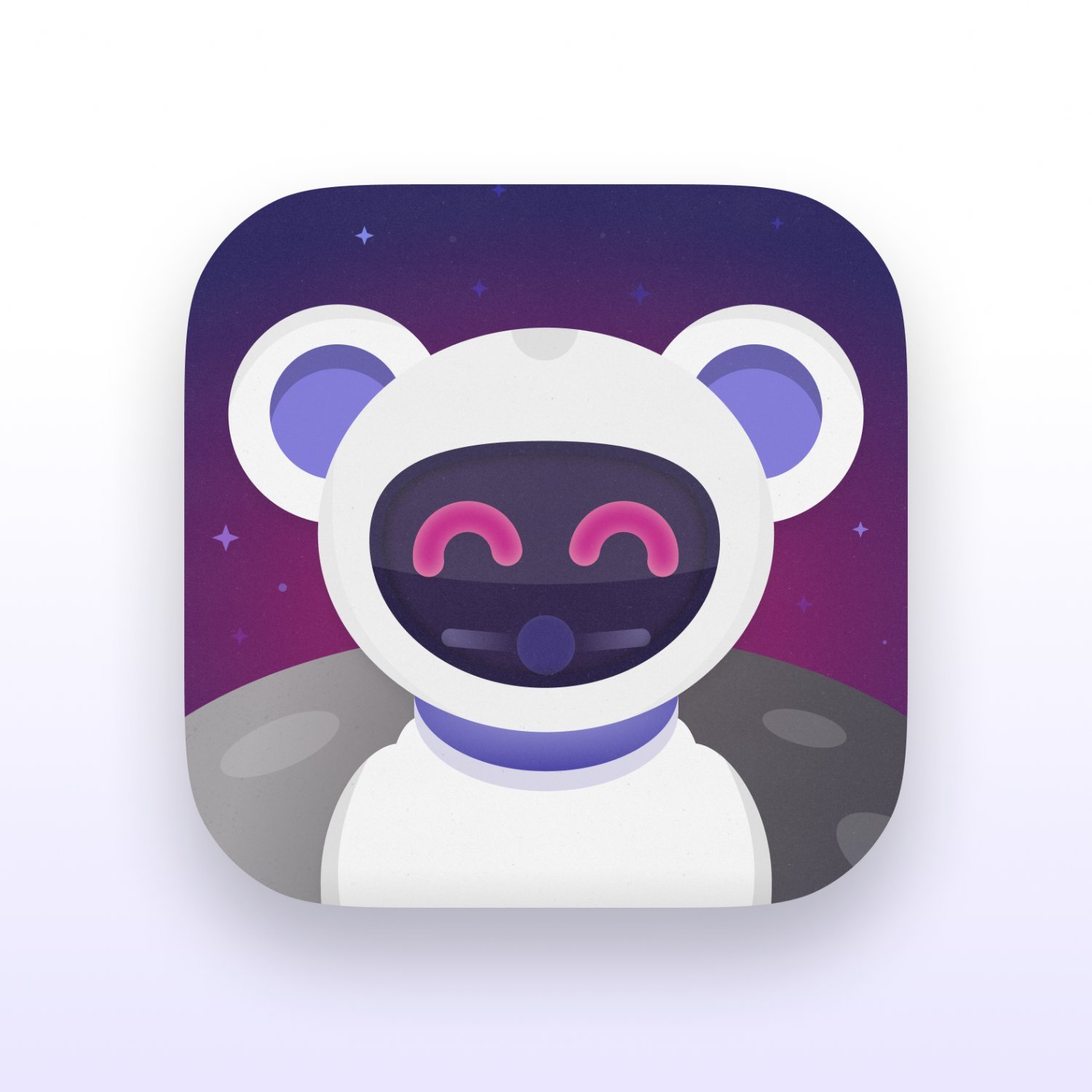
Edit: As people have asked, here's a free download link for the icon and another simplified variant I made based on some feedback. Here's a preview of the simplified variant.

all 15 comments
sorted by: hot top controversial new old
[–] [email protected] 24 points 1 year ago

i'm the jerk that pointed out the antenna thing, back to say good job!

[–] [email protected] 10 points 1 year ago

Fkin adorable!

[–] [email protected] 8 points 1 year ago

I really hope our wonderful dev will find a way to incorporate these into the native apps :)

[–] [email protected] 6 points 1 year ago* (last edited 1 year ago) (1 children)

Generally nice. I think the shadow on the left side of the body has the wrong color (basically invisible) and the face itself feels a bit crammed. Have you tried it without eyes (like this, maybe with a visor down), or perhaps a different eye color?

[–] [email protected] 4 points 1 year ago (2 children)

I think the eyes are pretty critical unfortunately. I agree that it could be simplified a bit. When scaled down on a home screen it looks a bit detailed. Here's a simplified version. I've reduced the strength of the nose and whiskers, and hidden the bottom whiskers under the visor. I've also removed the grid texture from the visor and the details from the space suit. I also made the moon darker so that the shadow on the left side of the torso isn't a problem anymore. Let me know what you think.

[–] [email protected] 1 points 1 year ago* (last edited 1 year ago)

Haha, critique about too much detail coming from the guy who crammed all kinds of shit into the current icon :D

Apart from the visor grid, which probably no one notices, I think having the details on the suit are nice and the colors match better in the original one, but that’s just my opinion. I could be wrong, but I think smaller eyes and white instead of red might look better.

Edit: I’m talking about myself btw, not sure if people are thinking I’m being rude to OP

[–] [email protected] 5 points 1 year ago (1 children)

I’d gladly take any of yours over the one that got picked. The current one has too much going on, and it feels out of place on my Home Screen.

[–] [email protected] 2 points 1 year ago

Yeah there’s definitely a lot going on in the current icon. There are multiple to choose from though (if you’re on iOS and on the native version).

[–] [email protected] 5 points 1 year ago
[–] [email protected] 4 points 1 year ago

Looks great! Really well done.

[–] [email protected] 4 points 1 year ago

Looks like an improvement to me

[–] [email protected] 3 points 1 year ago* (last edited 1 year ago) (1 children)

I really like this one, it’s detailed yet simple which works really well for an app icon! Personally I would love a download link, great job ( ◠‿◠ )

[–] [email protected] 5 points 1 year ago

Thanks! I've added a download link for this and the simpler variant I posted in the comments.

[–] [email protected] 3 points 1 year ago

Looks great!